.jpg)

.jpg)


We partnered with Modal from the outset to shape a brand identity that positions them as challengers in an institutional IOS market.
At its centre is a distinctive ‘M’ formed from five connected dots, representing Modal’s role in connecting key logistics networks. It forms the foundation of a modular identity system built around movement, connection and function.

The website brings the brand to life through a disciplined, system-led approach. Navigation is deliberately simple, layouts are stripped back, and data-led graphics take priority over decoration. The result is a site that mirrors Modal’s logistics-first thinking, clear, efficient and built to scale.


The Modal brand palette is rooted in the raw, textural qualities of industrial materials – Carbon, Graphite, Concrete and Stone. Each tone is drawn from surfaces commonly found in construction, manufacturing, and logistics environments, grounding the identity in the real-world context of the sector.


The typographic system pairs Seaon Sans with a contrasting monospaced typeface, striking a balance between clarity and utility. Season Sans brings structure and consistency across headings and key statements, while the mono font nods to the industrial and technical environments Modal operates in.

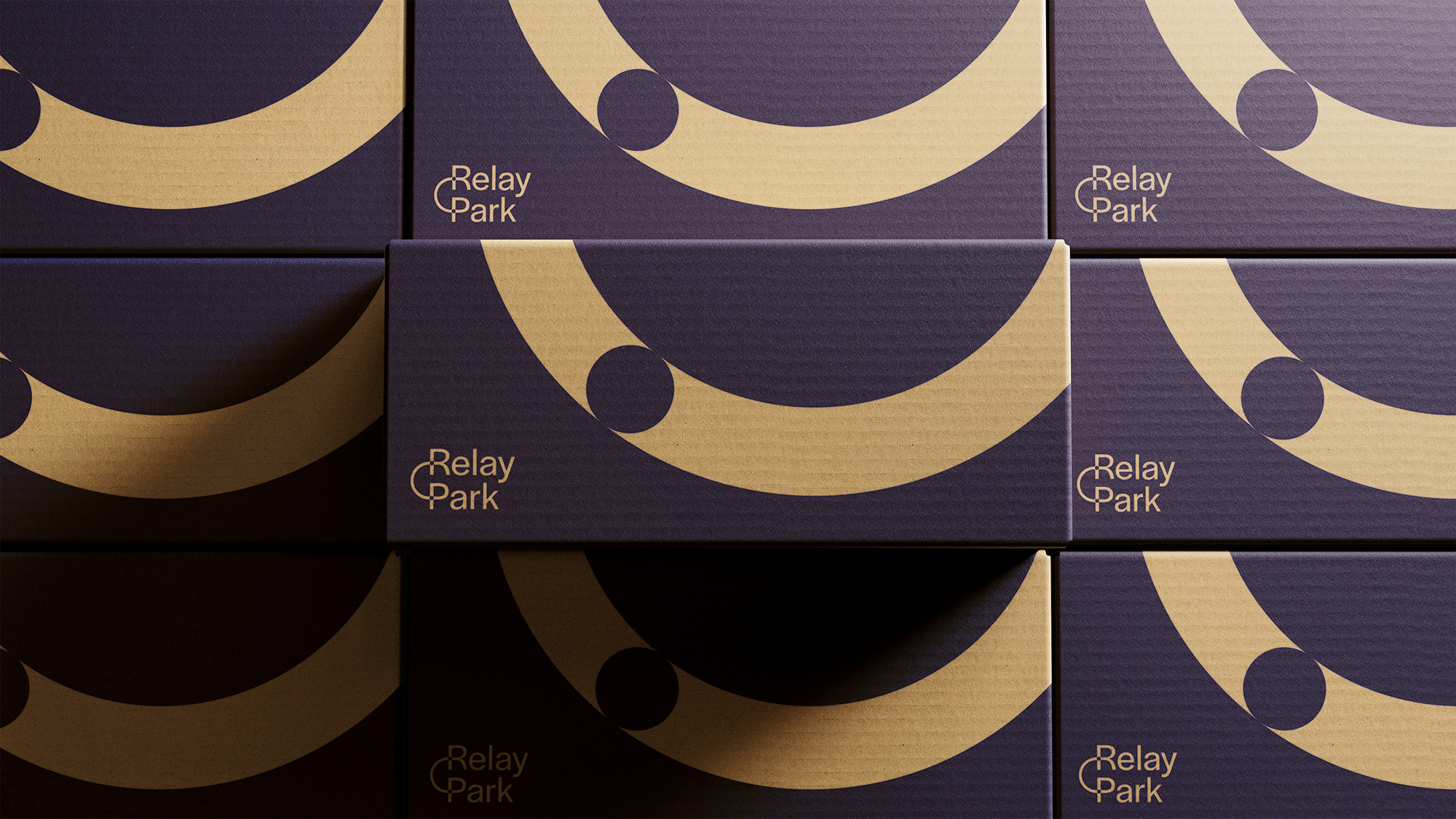
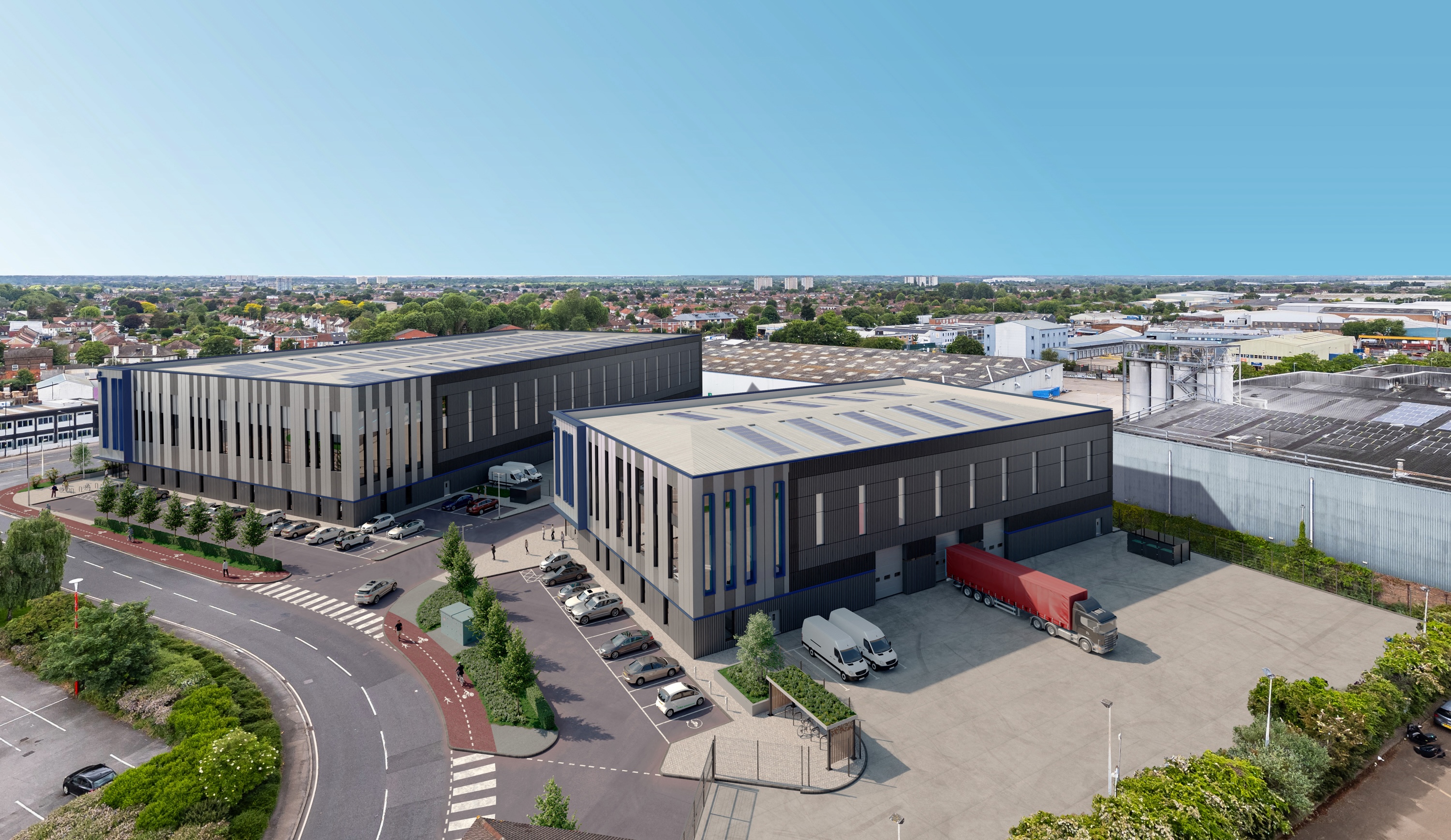
Partnering with PLP, we developed Relay Park as the brand identity for a two-unit industrial scheme in Enfield, positioned to serve London’s growing demand for last-mile logistics space. The challenge was to create a name and identity that felt purposeful and commercially credible, while clearly reflecting how the development functions within the wider supply chain. The brand needed to communicate movement, efficiency and connectivity in a way that was immediately legible across the industry.
.jpg)
The identity is built around a single, clear idea: movement from origin to destination. This is expressed through a simple, graphic workmark where two circular forms are connected by linear tracks, representing the transfer of goods through the logistics chain. The restraint of the mark is intentional. It creates an immediate visual link to efficiency, flow and connection, while giving the brand a strong, recognisable core that feels grounded in the operational reality of the asset.
.jpg)
.jpg)
.jpg)
Across applications from signage and marketing material to digital touchpoints, the identity delivers consistency without rigidity. It gives the scheme a distinctive presence and helps communicate its functional advantages with clarity. The result is a brand that not only looks purposeful, but feels like a living part of the logistics ecosystem it serves.